Overview
CloudManager
An application to manage the deployment of Bitrix24 document template libraries for document automation. ✨
Features
- Create and manage Template Libraries
- Create and manage library templates
- Create and manage template user fields
- Create and manage template library licenses
- Create and manage client portal accounts
- Deploy libraries to client portal
- Full access to the Bitrix24 rest API
- Tools to import and export data
- Documentation and information publishing (with full text search)
- Fully modular and extensible for future growth 🚀
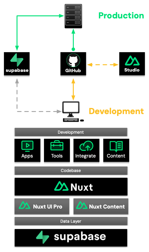
Architecture
Overview of the application system architecture and deployment flow .
Pages
Create your Markdown pages in the content/ directory:
# My title

This first paragraph will be treated as the page meta description.
You can overwrite meta tags by using front-matter:
---
title: 'Custom title'
description: 'Custom meta description'
image: 'Custom image injected as `og:image`'
---

# My title

This first paragraph will be treated as the page meta description.
This is done thanks to Nuxt Content's document-driven mode of Nuxt Content.
Navigation
The navigation is generated from your pages, you can take a look at the <AppNavbar> component to see how it works.
It uses the Navigation from Nuxt Content to fetch the navigation object.
To customize the title displayed in the navigation, you can set the navigation.title property in the front-matter of your pages:
---
navigation.title: 'Home'
---

# Welcome to my site

With a beautiful description
Theme configuration
You can configure Content Wind global configuration in the app.config.ts file:
interface AppConfigInput {
  cover?: string, // default: '/cover.jpg'
  socials?: {
    twitter?: string
    github?: string
    mastodon?: string
  }
}
Example of settings Twitter and GitHub icons in the navbar:
export default defineAppConfig({
  socials: {
    twitter: 'Atinux',
    github: 'Atinux/content-wind'
    mastodon: '@atinux@webtoo.ls'
  }
})
Icons
Use any icon from icones.js.org with the <Icon> component:
<Icon name="ph:music-notes-fill" />
You can also use it in your Markdown:
:icon{name="ph:music-notes-fill"}
Will result in
Learn more on nuxt-icon documentation.
Code Highlight
It supports code highlighting with Shiki and as well as different VS Code themes.
```ts
export default () => 'Hello Content Wind'
```
Will result in:
export default () => 'Hello Content Wind'
Updating the theme is as simple as editing your nuxt.config:
import { defineNuxtConfig } from 'nuxt'

export default defineNuxtConfig({
  content: {
    highlight: {
      theme: 'one-dark-pro',
    }
  }
})
Learn more in the Content Code Highlight section.
Vue Components
Add Vue components into the components/content/ directory and start using them in Markdown.
See the <MarkdownBlock> component in components/content/MarkdownBlock.vue.
By leveraging the <ContentSlot> component from Nuxt Content, you can use both slots and props in Markdown thanks to the MDC syntax.